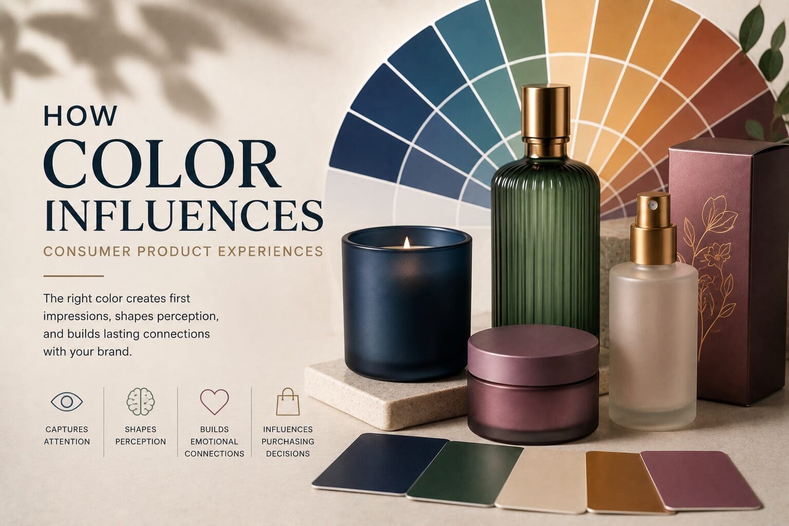
Color is often the first conversation a product has with a consumer.
Before someone reads a label, evaluates ingredients, or compares features, they are already forming opinions based on what they see. In many cases, those impressions happen within seconds.
That’s why color remains one of the most powerful tools in product design.
From luxury fragrances and premium candles to beauty products and beverage packaging, color helps shape expectations, communicate brand identity, and influence how consumers experience products long before they use them.
As part of a broader CMF (Color, Material, and Finish) strategy, color plays a critical role in creating memorable consumer product experiences.
Why Color Matters in Product Design
Consumers rarely evaluate products based on function alone.
Every purchasing decision involves a combination of rational and emotional factors. Color helps bridge those two worlds by creating immediate visual cues that influence how products are perceived.
The right color can help communicate:
- Quality
- Trust
- Luxury
- Innovation
- Sustainability
- Comfort
- Energy
- Sophistication
These perceptions begin forming almost instantly, often before consumers consciously realize they are happening.
This is why color is not simply a design choice. It is a communication tool.
Color Creates First Impressions
In competitive markets, products often have only a few moments to capture attention.
Whether a consumer encounters a product on a retail shelf, in an online storefront, or through social media, color is frequently the first element they notice.
Consider two products with identical functionality:
One uses muted, sophisticated tones and premium decorative finishes.
The other uses bright, highly saturated colors designed to create energy and excitement.
Both approaches may be effective, but they create entirely different expectations.
Color helps consumers quickly determine:
- Who the product is for
- What experience it promises
- How it fits within their lifestyle
- Whether it aligns with their preferences
Strong color strategy helps ensure those impressions support the brand’s intended message.
The Relationship Between Color and Consumer Perception
Different colors tend to evoke different emotional responses.
While personal experiences and cultural influences can affect interpretation, certain color associations remain consistently influential across consumer markets.
Blue
Blue is often associated with trust, reliability, confidence, and sophistication.
Many brands use blue to reinforce feelings of stability and quality.
Green
Green frequently communicates nature, wellness, sustainability, and freshness.
It is commonly used by brands seeking to emphasize natural ingredients or environmentally conscious values.
Black
Black is often connected to luxury, exclusivity, and premium positioning.
It remains one of the most effective colors for communicating sophistication.
White
White is associated with simplicity, cleanliness, and modernity.
Brands often use white to create a refined and minimalist aesthetic.
Warm Metallic Tones
Gold, bronze, and champagne-inspired finishes often signal quality, craftsmanship, and elevated experiences.
These colors can help reinforce premium positioning while adding visual depth.
The most effective color strategies consider not only individual colors but also how they support the overall product story.
Color Helps Build Brand Recognition
One of the most valuable benefits of color is its ability to strengthen recognition.
Consumers may forget advertising messages or product specifications, but they often remember visual cues.
Over time, consistent use of color helps brands become more recognizable across:
- Retail environments
- E-commerce platforms
- Social media
- Product photography
- Marketing materials
When consumers repeatedly encounter the same visual language, familiarity grows.
That familiarity helps build trust.
For brands looking to establish long-term recognition, color consistency becomes just as important as color selection.
Color Supports Product Positioning
Color helps consumers understand where a product fits within the market.
For example:
- Deep, muted colors may support luxury positioning.
- Soft neutrals often communicate wellness and simplicity.
- Bright colors can create excitement and accessibility.
- Earth-inspired tones frequently support natural or artisanal branding.
These visual cues help consumers quickly interpret the intended experience.
When color choices align with product positioning, brands create stronger connections between expectation and reality.
Color Must Work With Material and Finish
Color rarely exists in isolation.
As part of CMF design, color works alongside material and finish to create the complete product experience.
The same color can appear dramatically different depending on:
- Glass versus ceramic
- Matte versus gloss finishes
- Transparent versus opaque surfaces
- Metallic versus non-metallic effects
A navy blue applied to frosted glass may communicate softness and elegance.
The same navy blue applied with a high-gloss finish may feel bold and contemporary.
This is why successful color strategy considers the entire product presentation rather than focusing solely on color selection.
Consistency Matters as Brands Grow
As product lines expand, maintaining visual consistency becomes increasingly important.
A color that appears on:
- Candles
- Diffusers
- Room sprays
- Beauty packaging
- Promotional materials
should reinforce the same brand identity across every touchpoint.
Without consistent color standards, even strong brands can create confusion.
Consistency helps ensure customers recognize products immediately, regardless of where or how they encounter them.
Creating More Meaningful Consumer Experiences Through Color
The most successful brands understand that color is about more than appearance.
It influences perception, shapes expectations, and helps create emotional connections between products and consumers.
When color strategy aligns with brand identity, material selection, and decorative finishes, products become more than functional objects.
They become experiences.
As consumer expectations continue to evolve, thoughtful color design will remain one of the most effective ways for brands to create products that feel distinctive, memorable, and aligned with the experiences customers are seeking.