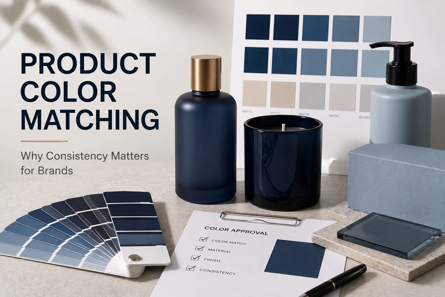
Color is often one of the first things consumers notice about a product. It influences perception, supports brand recognition, and helps communicate quality before a customer ever interacts with what’s inside the package.
But selecting the right color is only part of the process.
For brands, maintaining consistent color across production runs, product lines, and packaging formats can be just as important as choosing the color itself. When colors vary unexpectedly, the result can impact brand recognition, customer confidence, and overall product presentation.
That’s why product color matching plays a critical role in successful product development.
What Is Product Color Matching?
Product color matching is the process of creating and consistently reproducing a specific color across products, packaging, and production runs.
For many brands, color is a key component of their identity. Customers come to recognize a particular shade of blue, green, black, or other signature color as part of the brand experience.
Achieving that consistency requires more than simply selecting a color swatch. Manufacturers must account for materials, finishes, lighting conditions, application methods, and production variables that can all influence how a color appears.
The goal is simple: ensure the finished product looks the way the brand intended every time.
Why Consistent Color Matters
Consumers may not consciously notice slight color variations, but they often recognize when something feels different.
Inconsistent colors can create challenges such as:
- Reduced brand recognition
- Products that appear mismatched on retail shelves
- Perceived quality concerns
- Inconsistent customer experiences
- Difficulty maintaining premium brand positioning
For brands that invest heavily in packaging and visual identity, color consistency helps reinforce trust and professionalism.
The more recognizable a brand becomes, the more important consistency becomes.
Why Colors Look Different on Different Materials
One of the most common surprises during product development is discovering that the same color can look dramatically different depending on the surface it’s applied to.
For example, a color may appear differently on:
- Clear glass
- Frosted glass
- Ceramic vessels
- Aluminum containers
- Plastic packaging
- Matte finishes
- Gloss finishes
Surface texture, transparency, reflectivity, and material composition all affect how consumers perceive color.
A color that appears rich and vibrant on a printed sample may look softer or darker once applied to a finished product.
This is why experienced product development teams evaluate color on actual production materials whenever possible.
Pantone Colors Are a Starting Point, Not the Finish Line
Many brands begin the color development process using Pantone references, which provide a standardized framework for communication.
Pantone colors are incredibly valuable because they help designers, marketers, and manufacturers start from the same reference point.
However, Pantone guides are not a guarantee of final appearance.
The same Pantone color may require adjustments depending on the material, coating system, decoration process, and intended visual effect.
Successful color matching often involves refining and validating colors through testing rather than relying solely on a printed reference.
The Role of Physical Samples
Digital screens are useful tools, but they are not reliable color-matching devices.
Every screen displays color differently based on settings, calibration, brightness, and environmental conditions.
Because of this, physical samples remain one of the most effective ways to evaluate color accuracy.
Reviewing actual decorated products allows brands to assess:
- Color accuracy
- Opacity
- Finish appearance
- Lighting performance
- Overall product presentation
Physical sampling helps eliminate surprises before full-scale production begins.
Color Consistency Across Product Lines
Many brands expand beyond a single product into collections, seasonal launches, or multiple packaging formats.
Maintaining color consistency across these variations can become increasingly complex.
For example, a home fragrance brand may want the same signature color applied across:
- Candle vessels
- Diffusers
- Room sprays
- Gift sets
- Promotional packaging
Without a structured color management process, inconsistencies can quickly emerge.
Establishing color standards early helps ensure every product feels connected to the same brand family.
Common Challenges in Product Color Matching
Even well-planned projects can encounter color challenges.
Some of the most common include:
Material Variations
Different substrates interact with coatings and inks differently, which can affect final color appearance.
Lighting Conditions
Colors may appear different under retail lighting, natural daylight, office lighting, or photography environments.
Production Variables
Application methods, curing conditions, and material batches can all influence results if not carefully controlled.
Expectations vs. Reality
Colors viewed on screens or printed design proofs often differ from how they appear on finished products.
Understanding these factors early helps create smoother product development timelines and more predictable outcomes.
Building a Stronger Brand Through Color Consistency
Color is more than a design choice. It is a brand asset.
When customers repeatedly encounter the same visual cues, they build familiarity and trust. Consistent color reinforces brand recognition and creates a more cohesive product experience across every customer touchpoint.
While selecting the right color is important, maintaining that color from concept through production is what ultimately brings the brand vision to life.
The brands that achieve long-term visual consistency are often the ones that treat color as a strategic part of product development rather than a final design detail.
When color selection, testing, and production work together, brands can move forward with greater confidence knowing their products will look the way they were intended to look every time.