Color psychology is often presented as a list.
Blue means trust.
Green means wellness.
Black means luxury.
Red means energy.
But knowing what a color represents is not the same as knowing how to use it.
In product development, color is not symbolic decoration. It is a positioning decision.
If you want color psychology to work for your brand, it needs to move from theory to application.
Here’s how to do that.
Step 1: Define the Emotional Outcome First
Before selecting a color, define what you want your product to feel like on shelf.
Not just “premium.”
Be specific.
Do you want it to feel:
- Grounded and stable
- Elevated and aspirational
- Clean and minimal
- Bold and disruptive
- Warm and comforting
- Refined and understated
The emotional outcome comes first. The hue supports it.
If you skip this step, you end up choosing colors based on preference instead of strategy.
Step 2: Evaluate Category Saturation
Color psychology does not operate in isolation. It operates within a competitive landscape.
If every brand in your category uses soft sage to signal calm, adding another sage vessel does not reinforce calm. It reinforces sameness.
Ask:
- What colors dominate our shelf space?
- Are those tones overused?
- Are we blending in when we intend to stand out?
Sometimes differentiation is not about choosing a new emotional direction. It is about executing the same emotion in a more distinctive way.
Step 3: Align Color With Price Positioning
Color impacts perceived value.
A pastel matte finish may feel approachable.
A deep, layered tone with satin finish may feel elevated.
A high-gloss bright hue may feel energetic but less restrained.
If your goal is premium positioning, your color depth and finish need to support that price point.
Consumers often assess value visually before reading a label.
Your surface treatment communicates craftsmanship.
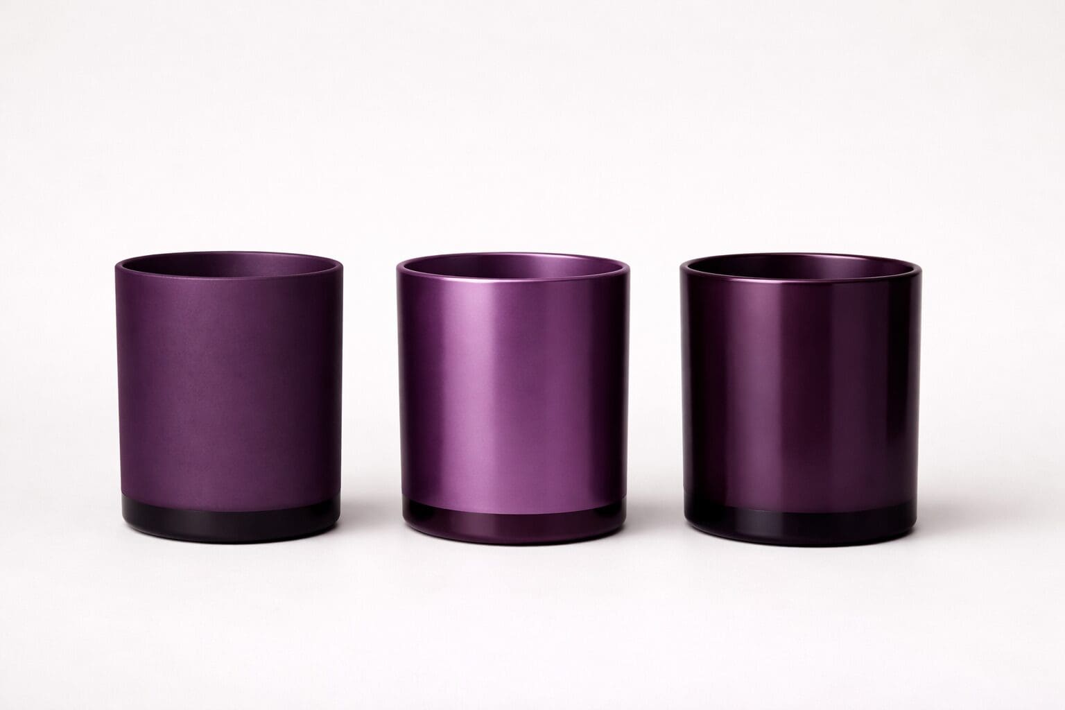
Step 4: Consider Finish, Not Just Hue
Two brands can use the same base color and communicate completely different messages.
For example:
A soft blue in flat matte may feel calm and minimal.
That same blue in a frosted translucent finish with metallic detail may feel refined and intentional.
Finish changes emotional impact.
Matte can feel grounded.
Satin can feel elevated.
Gloss can feel modern.
Metallic accents can add perceived luxury.
Color psychology without finish strategy is incomplete.
Step 5: Think in Systems, Not Single Launches
One product can experiment. A brand system must remain cohesive.
When applying color psychology, consider:
- How does this launch fit within our broader palette?
- Are we evolving intentionally or reacting to trends?
- Does this color direction have longevity?
Color direction should support your long-term brand story, not just the next release.
A Practical Example
Imagine a luxury candle launch.
Instead of defaulting to dusty blue for calm, you might ask:
What emotional outcome are we aiming for?
If the answer is “elevated relaxation,” that may lead you toward:
- A deeper neutral rather than a pastel
- A satin finish instead of flat matte
- Subtle screen print to signal craftsmanship
The emotion remains calm. The execution signals progression.
That is strategic use of color psychology.
The Bigger Takeaway
Color psychology is not about memorizing meanings.
It is about aligning emotional intention, market context, finish, and positioning.
When those elements work together, color becomes an asset rather than an afterthought.
The most effective brands are not the ones using the trendiest colors.
They are the ones using color with intention.