For several years, color direction was heavily influenced by one dominant theme: wellness.
Soft greens. Muted blues. Clean neutrals. Light woods. Airy palettes.
These tones signaled calm, balance, and reassurance. And during uncertain times, that made sense. Consumers were looking for stability.
But emotional priorities shift. And when they do, color shifts with them.
In 2026, we are seeing movement away from purely calming palettes and toward something more layered and aspirational.
Not louder. Not trendier.
More elevated.
The Saturation of “Calm”
Wellness-driven color palettes became the default across multiple categories:
- Home fragrance
- Personal care
- Beauty
- Beverage packaging
- Lifestyle brands
Soft sage. Dusty blue. Warm beige. Muted eucalyptus.
These tones communicated clean living and emotional grounding.
The challenge is not that these colors stopped working. It’s that they became universal.
When every brand communicates calm in the same way, calm no longer differentiates.
Today’s Emotional Climate Is Different
Consumers are still tired. But they are also seeking forward movement.
There is visible fatigue around:
- Constant wellness messaging
- Institutional distrust
- Economic pressure
- Predictable “safe” design
Instead of simply calming down, many consumers want to feel lifted. Elevated. Upgraded.
That emotional desire is influencing color direction in subtle but noticeable ways.
What “Elevation” Looks Like in Color
Elevation does not mean bright or loud.
It often shows up as:
- Deeper jewel tones with restraint
- Layered warm neutrals instead of flat beige
- Complex charcoals with warmth
- Saturated hues paired with metallic or satin finishes
- Dimensional coatings that add depth
Where wellness palettes felt airy and minimal, elevated palettes feel grounded and intentional.
There is more weight. More substance. More contrast.
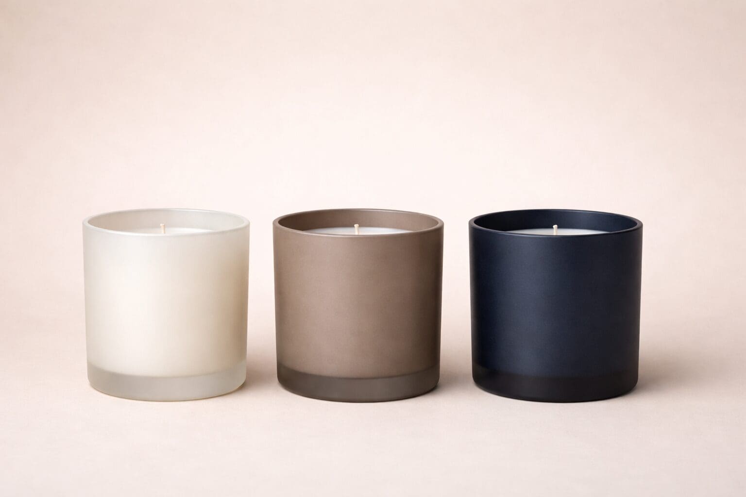
This shift is especially visible in premium candle and personal care launches, where brands are moving toward richer tones that signal quality and craftsmanship rather than simplicity alone.
The Role of Finish in Elevation
Color alone does not create elevation. Execution does.
A deep plum in a flat matte can feel heavy.
That same plum in a soft satin coating with metallic screen print can feel refined.
Similarly, a neutral taupe can feel basic in gloss, but sophisticated in a layered custom blend with subtle texture.
Finish changes perception.
Specialty coatings, custom color matching, and thoughtful surface treatments allow brands to maintain restraint while increasing perceived value.
Elevation is rarely about boldness. It is about depth.
What This Means for Product Development
If your brand has relied heavily on soft wellness palettes, this is not a call to abandon them. It is a call to evaluate them.
Ask:
- Does our current palette reflect where our customer wants to go?
- Are we communicating calm, or are we communicating intention?
- Does our color and finish support our price positioning?
- Are we visually differentiated in our category?
In many cases, elevation can be achieved without dramatic change. It may mean:
- Deepening an existing hue
- Adding subtle warmth
- Adjusting sheen
- Introducing contrast through decoration
Small refinements can signal meaningful progression.
The Bigger Shift
Color direction is always a response to emotional climate.
Wellness was about stability.
Elevation is about upward movement.
Brands that recognize this shift early can evolve in a way that feels thoughtful rather than reactive.
The goal is not to chase trends. It is to align color decisions with the emotional reality of your audience.
When color supports aspiration, craftsmanship, and depth, it does more than decorate a package.
It reinforces value.