The Shift Toward Grounded Warmth
Autumn 2026 packaging trends are moving in a softer direction.
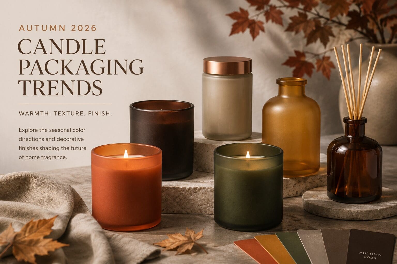
After years of stark minimalism and high-contrast palettes, candle and home fragrance brands are leaning into something more atmospheric: warmth, texture, and emotional comfort. The season is defined by layered earth tones, muted botanicals, softened neutrals, and finishes that create depth through light interaction rather than heavy saturation.
For brands developing seasonal collections, Autumn 2026 presents an opportunity to create packaging that feels tactile, restorative, and intentionally lived-in.
At JAFE, we explored these emerging directions through our Autumn 2026 Color Guide, pairing curated seasonal colors with decorative finishes designed to shift how color behaves across glass.
[Download the Autumn 2026 Color Guide]
Earth-Toned Palettes Continue to Lead
Warm, grounded color stories are becoming increasingly important across candle and home fragrance packaging.
This season’s direction favors:
- muted spice tones
- smoky browns
- botanical greens
- warm mineral neutrals
- softened amber hues
Rather than relying on overly saturated seasonal colors, many brands are creating collections that feel calming, dimensional, and versatile across multiple product categories.
These palettes work especially well for:
- luxury candle collections
- home fragrance launches
- wellness-focused brands
- elevated seasonal assortments
- hospitality-inspired packaging
Finish Is Becoming Part of the Experience
Color alone no longer carries the full visual story.
In Autumn 2026, decorative finish plays a major role in how consumers experience packaging. The same color can shift dramatically depending on whether it’s applied in a matte, gloss, translucent frost, or shimmer finish.
This is especially important for candle packaging because finish directly influences:
- candlelight diffusion
- shelf presence
- perceived warmth
- softness
- depth
- luxury perception
For example:
- Opaque matte finishes create a grounded, velvety feel
- Translucent frost softens illumination and adds atmospheric glow
- Transparent gloss increases saturation and vibrancy
- Shimmer finishes introduce warmth and dimensionality without overpowering the palette
As consumers continue gravitating toward sensory-driven products, finish behavior is becoming just as important as the color itself.
Autumn 2026 Color Directions to Watch
Smoked Browns and Deep Earth Tones
Rich espresso-inspired tones continue gaining traction across candle vessels and fragrance packaging. These colors create depth while still feeling approachable and warm.
Best paired with:
- matte finishes
- low-gloss translucent effects
- amber lighting environments
Muted Botanical Greens
Earthy greens are evolving beyond bright botanical tones into softer, restorative shades that feel grounded and calming.
These colors work particularly well across:
- reed diffusers
- wellness collections
- spa-inspired packaging
- luxury home fragrance lines
Warm Mineral Neutrals
Soft taupes, worn stone shades, and linen-inspired neutrals are helping brands create more versatile seasonal collections that transition beyond fall.
These tones are increasingly used to:
- soften brighter seasonal colors
- create layering within collections
- support minimalist luxury aesthetics
Soft Harvest Ambers
Golden amber-inspired hues continue to perform strongly in autumn packaging because they interact beautifully with candlelight and translucent finishes.
When paired with frosted glass, these colors create a warm, illuminated effect that feels premium without becoming overly dramatic.
Seasonal Collections Are Expanding Beyond Candles
One of the strongest shifts happening across packaging is the move toward coordinated cross-category collections.
Rather than designing candles separately, brands are increasingly building cohesive systems that include:
- candles
- reed diffusers
- room sprays
- fragrance bottles
- cosmetic containers
- lifestyle accessories
This approach creates:
- stronger brand recognition
- better merchandising opportunities
- elevated giftability
- a more immersive customer experience
Decorative glass finishes make it easier to carry a seasonal palette consistently across multiple container types while still allowing each category to feel distinct.
Atmosphere Matters More Than Ever
Consumers are responding to packaging that feels emotionally connected to their environment.
Autumn 2026 packaging trends reflect broader shifts toward:
- comfort
- ritual
- slower living
- tactile design
- ambient home experiences
For candle and fragrance brands, this means packaging is no longer simply decorative. It becomes part of the atmosphere itself.
Color, finish, translucency, and light interaction all contribute to how a product feels before it is ever opened.
Bringing Seasonal Color Into Production
Translating trend direction into real production requires more than selecting a palette.
Consistency across:
- finishes
- substrates
- opacity levels
- lighting environments
- container forms
is what ultimately determines whether a collection feels cohesive at retail.
At JAFE, we work closely with brands to develop decorative glass solutions that balance seasonal trend direction with manufacturability, finish performance, and production consistency across categories.
Explore the Autumn 2026 Color Guide
Our Autumn 2026 Color Guide explores:
- seasonal color forecasting
- decorative finish behavior
- coordinated packaging inspiration
- cross-category applications
- production-ready decorative possibilities
Download the guide to explore the full collection and discover how Autumn 2026 color direction is evolving across candle and home fragrance packaging.