When your product hits the retail shelf, it’s not just competing on fragrance, function, or price—it’s competing visually. That first glance from a shopper? It’s make-or-break. And if the color of your glass vessel isn’t telling the right story, you could be losing customers without even realizing it.
One of the most common reasons for visual inconsistencies in retail?
Metamerism.
It’s a color science term with very real retail consequences—and smart brands are learning to plan for it early in the design process.
What Is Metamerism?
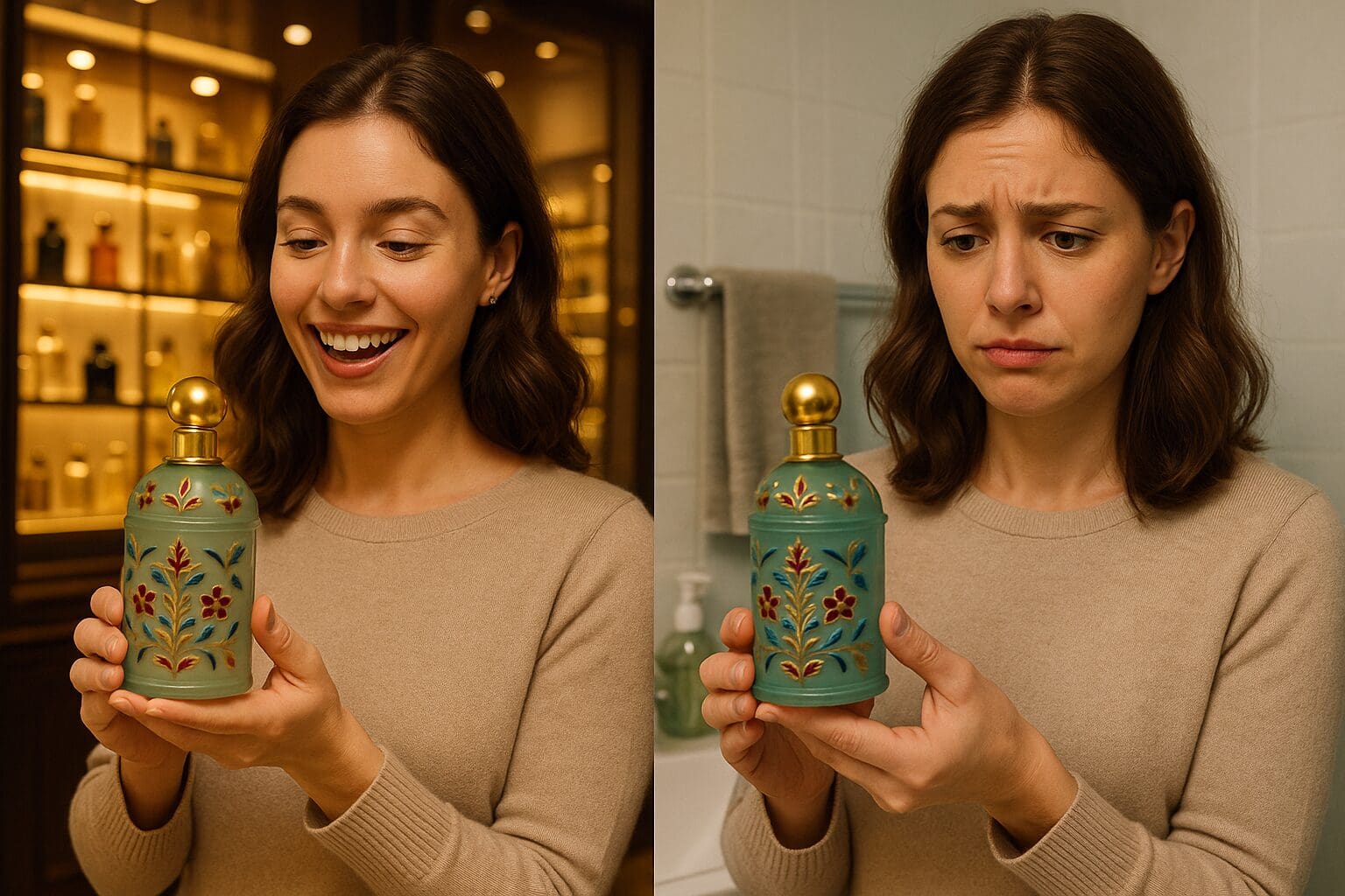
Metamerism is when two colors appear to match under one light source, but look noticeably different under another.
It’s the reason your product might look perfect in the design studio or warehouse… but shift unexpectedly once it’s under the overhead lights of a boutique or on a Target shelf. Suddenly, your “Dusty Rose” jar looks more like salmon, and that rich “Espresso Brown” takes on an odd purple hue.
Retail Lighting vs. Home Lighting: A Visual Tug-of-War
The same product can appear completely different depending on where and how it’s viewed:
- Retail Stores: Fluorescent or LED lighting, often cooler and brighter
- Boutiques: Warm-toned, ambient lighting to create a cozy mood
- Homes: A mix of natural daylight, soft lamps, or warm overhead lights
- Online: Product photos are usually taken in controlled lighting—often daylight-balanced
Now imagine your customer buys your product in-store, then opens it at home and thinks,
“Wait… this doesn’t look the same.”
Even if your product is technically identical, that shift in perception can affect how your brand is experienced—and how likely a customer is to repurchase or recommend.
Why This Matters for Brands Selling in Retail
When you’re scaling a product into retail, you lose a little control over how your product is displayed—but not over how it’s perceived. That’s why it’s essential to plan for lighting environments before your product ever goes to production.
Inconsistent or “off” coloring can:
- Disrupt shelf appeal
- Break brand cohesion across SKUs
- Confuse or disappoint returning customers
- Lead to costly returns or negative reviews
How JAFE Decorating Helps You Design for Real-World Lighting
At JAFE Decorating, we understand how lighting changes everything—especially when it comes to painted glass. That’s why we’ve built color accuracy and metamerism checks into our process:
Multi-Environment Light Testing
We test all custom colors under several types of lighting—including daylight, fluorescent, and warm incandescent—to ensure your vessel color performs beautifully wherever it’s sold.
Design Phase Support
If you tell us you’re headed into retail, we’ll flag color or finish options that are more prone to shifting. We’ll help you find a version of your brand color that holds steady across lighting conditions.
Batch-to-Batch Consistency
We retain color samples from every approved project so your packaging stays consistent—even across seasonal launches, reorders, or expansions into new retail spaces.
A Beautiful Product Is One That Looks Great Everywhere
At the end of the day, your customers don’t care about lighting conditions—they care that your product looks how they expected it to. Metamerism might be invisible to them, but its effects are not.
Designing with lighting in mind isn’t just smart—it’s essential.
With the right guidance and attention to detail, you can deliver a consistent brand experience whether your product is sitting on a boutique shelf, glowing on a candlelit mantle, or featured in a customer’s Instagram Story.
📩 Planning a product line for retail or boutiques?
Let’s make sure your color story doesn’t shift with the lighting.
Download our catalog or schedule a consultation with our decorating experts today.