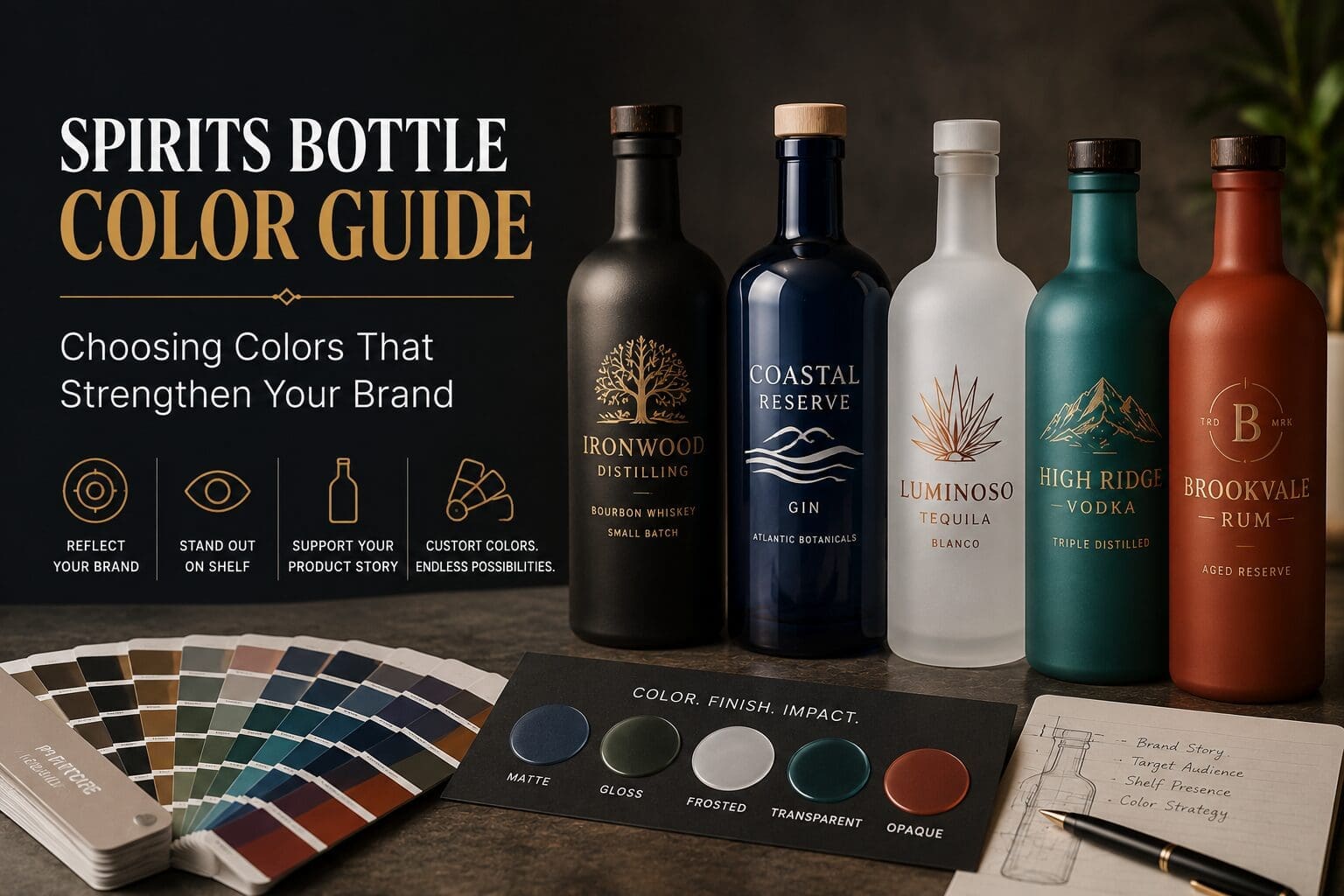
Color is often one of the first things customers notice about a spirits bottle.
Before they read the label or learn the story behind the product, they’ve already formed an impression based on the bottle sitting in front of them. Color influences how a product feels on the shelf, how it fits within a portfolio, and whether it reflects the personality of the brand.
A carefully developed color strategy can help create recognition, differentiate products, and elevate the overall customer experience.
This guide explains how to approach color selection for custom spirits bottles and what to consider before moving into production.
Start With Your Brand
Choosing a bottle color should begin with your brand, not current design trends.
Ask yourself:
- What impression should the bottle make?
- What makes this product different from competitors?
- Where will customers encounter it first?
- How should it fit within your existing product line?
- Will the packaging still represent your brand several years from now?
Answering these questions creates a stronger foundation than selecting a color simply because it is popular.
Think About Where Your Bottle Will Be Seen
The same bottle can look very different depending on where it is displayed.
Your packaging may appear:
- On a retail shelf
- Behind a bar
- In a restaurant
- In online product photography
- In social media content
- In promotional displays
Lighting, surrounding products, and viewing distance all influence how color is perceived.
Selecting a color that performs well across multiple environments helps create a more consistent customer experience.
Custom Colors Create Brand Recognition
Many successful spirits brands become recognizable long before customers read the label.
Consistent use of color helps build that recognition.
Custom spray coating allows brands to develop colors that align with:
- Brand standards
- Existing packaging
- Marketing materials
- Product families
- Future product launches
Rather than choosing from a limited group of colors, brands can develop a finish that reflects their own identity.
Transparent or Opaque?
One of the first decisions is whether the glass should remain visible.
Transparent Colors
Transparent coatings add color while allowing light to pass through the glass.
This approach works well when you want customers to see the product while adding depth and visual interest.
Opaque Colors
Opaque coatings provide complete coverage across the bottle.
They create a bold, consistent appearance and allow the bottle itself to become a defining part of the brand.
Neither option is inherently better. The right choice depends on the story you want your packaging to tell.
Choosing the Right Finish
Color is only one part of the final appearance.
The finish also changes how customers perceive the bottle.
Matte Finishes
Matte coatings create a smooth, refined appearance with minimal reflection.
They are often selected for brands that want a contemporary or understated look.
Gloss Finishes
Gloss coatings reflect more light and emphasize color.
They can create additional visual impact and help bottles stand out in retail environments.
Frosted Finishes
Frosted finishes soften the appearance of the glass and create an elegant, premium look.
Many brands pair frosted finishes with screen-printed decoration for a clean and sophisticated presentation.
Build a System Instead of Individual Bottles
If your product line includes multiple spirits, think about how each bottle fits within the collection.
A coordinated color strategy can help customers recognize your brand while making it easy to distinguish between products.
Examples include:
- Different barrel finishes
- Flavor extensions
- Seasonal releases
- Limited editions
- Reserve collections
When each bottle feels related without looking identical, the collection becomes easier to navigate and stronger on the shelf.
Sample Before You Commit
Digital renderings are helpful, but they cannot fully represent how color will appear on decorated glass.
Sampling allows you to evaluate:
- Color accuracy
- Finish selection
- Screen printing compatibility
- Lighting conditions
- Shelf appearance
Reviewing physical samples before production provides an opportunity to make adjustments while changes are still simple to implement.
Questions to Ask Before Approving a Color
Before moving into production, consider the following:
- Does this color support our brand identity?
- Will it stand out where it will be sold?
- Does it work with our decoration method?
- Will it fit with future products?
- Does the finish reflect the quality we want customers to associate with our brand?
Taking time to answer these questions can help avoid costly revisions later.
Common Spirits Bottle Color Questions
Can spirits bottles be custom colored?
Yes. Spray coating can create a wide variety of custom colors and specialty finishes.
Can colors be matched to our existing branding?
In many cases, yes. Color matching can often be achieved using Pantone references, physical samples, or approved standards.
Which finish is better: matte or gloss?
Each creates a different appearance. The best choice depends on your brand, product positioning, and desired customer experience.
Can different products in the same collection use different colors?
Absolutely. Many brands use color to distinguish products while maintaining a consistent overall design.
Should I review samples before production?
Yes. Physical samples provide the most accurate representation of how color and decoration will appear on the finished bottle.
Color Is Part of Your Brand Story
A bottle’s color does more than make it look attractive. It helps communicate quality, creates recognition, and shapes the way customers remember your brand.
When color selection is approached as part of the overall packaging strategy, it becomes a valuable tool for building a stronger product and a more recognizable brand.
Whether you’re launching a single product or developing an entire portfolio, investing time in color development can help create packaging that continues to perform long after it reaches the shelf.