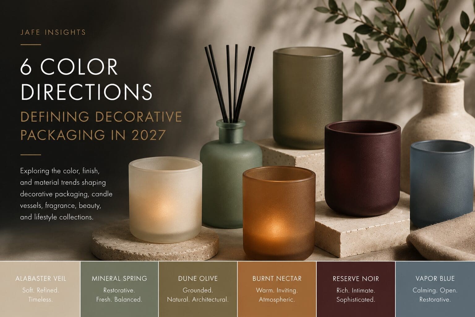
Decorative packaging is moving into a softer, more emotionally intentional era.
Across candles, home fragrance, beauty, wellness, and lifestyle packaging, brands are embracing color palettes that feel calmer, warmer, and more atmospheric. Instead of relying on high contrast and visual intensity, many collections are shifting toward grounded tones, layered translucency, and tactile finishes that create a stronger emotional connection with consumers.
For decorative glass packaging especially, color is becoming closely tied to:
- finish
- texture
- glow behavior
- atmosphere
- material interaction
The following six color directions are emerging as some of the most commercially relevant for 2027.
1. Alabaster Veil
Soft mineral neutrals continue gaining momentum across premium decorative packaging.
Alabaster Veil is a warm ivory tone inspired by softened stone and refined natural materials. It feels calming, elevated, and highly versatile across candle vessels, wellness collections, and home fragrance packaging.
This direction works especially well in decorative applications that emphasize softness, atmosphere, and understated luxury.
2. Mineral Spring
Restorative greens are evolving into softer, more atmospheric color directions.
Mineral Spring introduces a calming green tone that feels emotionally fresh without becoming overtly botanical. The color supports wellness-inspired collections while maintaining a refined, modern aesthetic.
Especially impactful across candle vessels, diffusers, and decorative glass applications.
3. Dune Olive
Grounded olive tones continue expanding across luxury packaging and home fragrance.
Dune Olive balances warmth and restraint while introducing a more architectural, material-focused aesthetic. It feels natural without becoming rustic and sophisticated without feeling overly formal.
This direction aligns particularly well with hospitality, wellness, and lifestyle packaging collections.
Several of these emerging tones become even more impactful when paired with layered translucency, tactile matte coatings, and glow-enhancing decorative finishes explored further in the full report.
4. Burnt Nectar
Warm amber-inspired tones are becoming softer and more atmospheric moving into 2027.
Burnt Nectar draws inspiration from candlelight, warmth, and emotional comfort. Rather than feeling energetic or overly saturated, the direction feels grounded, inviting, and sensory-driven.
This palette direction is especially strong for decorative glass packaging designed to create atmosphere within interior spaces.
5. Reserve Noir
Deeper wine-inspired tones are evolving into quieter, more emotionally sophisticated luxury colors.
Reserve Noir creates richness and depth while maintaining softness and restraint. The direction feels intimate, premium, and highly adaptable across fragrance, candle, and hospitality collections.
Rather than relying on high gloss or excessive contrast, this color creates impact through atmosphere and material presence.
6. Vapor Blue
Atmospheric blues continue growing across wellness and home fragrance packaging.
Vapor Blue introduces calmness and openness while maintaining enough depth to feel contemporary and refined. Softer than traditional cool blues, the direction feels more emotional, restorative, and tactile.
This palette direction works especially well across decorative glass, spa-inspired collections, and calming lifestyle environments.
Color Is Becoming More Atmospheric
One of the biggest shifts happening across decorative packaging is the growing relationship between color and finish.
In 2027, the strongest collections will rely not only on color itself, but also on:
- translucency
- texture
- layered surfaces
- tactile coatings
- light interaction
- material softness
For decorative glass packaging, these details help shape how products feel emotionally within a consumer’s environment.
That shift is especially important across candles, home fragrance, beauty, and wellness categories where products increasingly function as part of the overall sensory experience.
Explore the Full 2027 Color & Material Direction Report
To help brands navigate these evolving decorative packaging trends, we created the JAFE 2027 Color & Material Direction Report.
Inside the report:
- Emerging color direction for decorative packaging
- Finish and texture trends shaping 2027
- Matte, frosted, and layered glass applications
- Decorative insights for candles, home fragrance, beauty, and lifestyle packaging
- The complete JAFE 2027 Core Collection
Download the full report to explore the color, finish, and material directions shaping decorative packaging in 2027 and beyond.