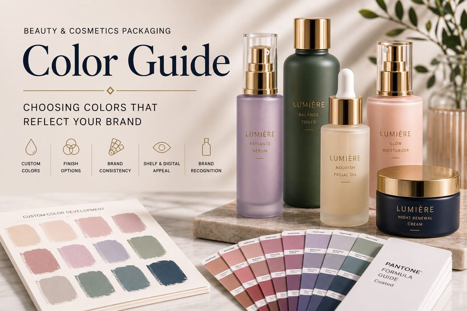
Color is often the first detail customers notice when they pick up a beauty product.
Long before they experience the formula inside, they begin forming opinions about the brand based on the package in front of them. The color of a bottle or jar can communicate elegance, simplicity, energy, wellness, or sophistication within seconds.
For beauty brands, color is more than a design choice. It is an important part of building recognition, creating consistency, and shaping the customer experience.
This guide explores how to develop a thoughtful color strategy for custom beauty packaging.
Start With Your Brand Identity
Before selecting a color, consider what you want customers to experience when they interact with your product.
Ask yourself:
- What emotions should the packaging communicate?
- Who is your target customer?
- How should your product be positioned in the market?
- What makes your brand different?
- Will this color still represent your brand as your product line grows?
Answering these questions helps establish a foundation for every color decision that follows.
Think Beyond Individual Products
Many successful beauty brands develop collections rather than individual packages.
A coordinated color strategy helps customers recognize your brand while making it easy to distinguish between different products.
Examples include:
- Daily skincare routines
- Product collections
- Seasonal launches
- Limited editions
- Product strengths or formulations
A consistent color system creates a more cohesive brand experience.
Custom Color Development
Custom colors allow your packaging to reflect your brand rather than relying on standard stock finishes.
Color development often begins with:
- Pantone references
- Brand guidelines
- Existing packaging
- Marketing materials
- Physical samples
Developing custom colors helps maintain consistency across your entire product portfolio.
Transparent or Opaque?
The appearance of the glass changes significantly depending on the finish you choose.
Transparent Colors
Transparent coatings allow the beauty of the glass and, in many cases, the product itself to remain visible.
This approach works well for products where the formulation contributes to the overall presentation.
Examples include:
- Facial oils
- Serums
- Fragrance
- Bath products
Opaque Colors
Opaque finishes completely cover the glass surface.
They create a bold, consistent appearance and allow the package itself to become a defining part of the brand.
Opaque finishes are commonly selected for products where color consistency is a priority.
Matte, Gloss, or Frosted?
The finish you choose influences how customers perceive the package.
Matte Finishes
Matte finishes create a soft, refined appearance with minimal reflection.
They are often selected by brands that want a clean, contemporary aesthetic.
Gloss Finishes
Gloss finishes reflect light and emphasize color depth.
They create a polished appearance that works well for energetic and modern brands.
Frosted Finishes
Frosted finishes soften the appearance of the glass and create a premium, elegant presentation.
Many luxury skincare and fragrance brands use frosted glass to reinforce a high-end customer experience.
Color Consistency Matters
Customers often recognize brands by color before they recognize logos.
Maintaining consistent colors across packaging helps strengthen brand recognition and creates a more professional appearance.
Consistency becomes especially important when expanding into new product categories or introducing additional SKUs.
Consider Where Your Products Will Be Seen
Your packaging will likely appear in several environments.
Consider how your chosen colors perform:
- On retail shelves
- In online stores
- In product photography
- On social media
- In influencer content
- Under different lighting conditions
Evaluating colors across multiple environments helps ensure your packaging remains consistent wherever customers encounter it.
Review Physical Samples
Digital mockups are helpful, but they cannot fully represent how color appears on decorated glass.
Before approving production, review physical samples to evaluate:
- Color accuracy
- Finish selection
- Decoration quality
- Overall presentation
Sampling allows you to make adjustments before production begins.
Common Color Questions
Can glass containers be custom colored?
Yes. Custom spray coating allows glass containers to be finished in a wide range of colors and specialty finishes.
Can colors be matched to my brand?
In many cases, yes. Custom colors can often be developed using Pantone references or approved physical samples.
Should I choose matte or gloss?
The best choice depends on your brand identity, product positioning, and the customer experience you want to create.
Can different products use different colors?
Absolutely. Many brands use coordinated color systems to distinguish products while maintaining a consistent visual identity.
Should I approve a physical sample before production?
Yes. Reviewing physical samples is one of the best ways to evaluate color, finish, and decoration before moving into production.
Color Helps Tell Your Brand Story
The right color strategy does more than create attractive packaging.
It helps customers recognize your products, reinforces your brand identity, and creates consistency across every collection you introduce.
Whether you’re launching a single serum or building an entire skincare line, thoughtful color development helps create packaging that customers remember long after they’ve finished using the product.