In candle and fragrance packaging, color isn’t just decoration — it’s communication. The right hue can signal mood, suggest quality, and even influence a buying decision before a product is touched or smelled. For brand designers, understanding the psychology of color is essential to creating packaging that resonates with consumers and strengthens brand identity.
Why Color Choice Matters
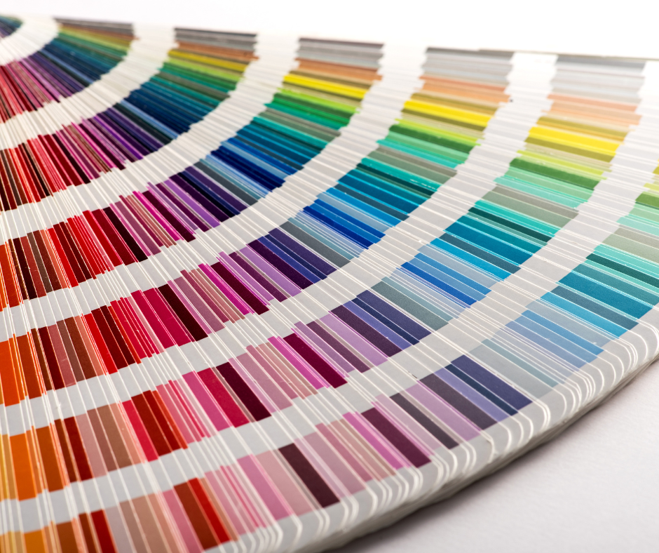
Research shows that up to 90% of first impressions are based on color alone. For candles and decorated perfume bottles, this means the shade of the vessel, the tone of the screen printing, and the finish of specialty coatings all work together to create an emotional connection.
In candle containers, warm colors like amber, deep red, and matte gold often communicate comfort, tradition, and luxury. In fragrance bottles, cooler tones like frosted silver, pale blush, or muted sapphire can evoke sophistication, freshness, and subtle elegance. When executed with precision, whether through glass decoration or glass screen printing, these choices turn a functional container into a brand asset.
How Consumer Needs Shape Color Preferences
Color choices aren’t static. They shift alongside changing consumer priorities and emotional needs. This isn’t just about general color families, but also the specific hues and tones within them. In times of uncertainty, shoppers may gravitate toward deeper, muted variations like warm taupe, dusty rose, or forest green in candle jars and fragrance packaging, seeking stability and familiarity.
When optimism and self-expression are on the rise, those same consumers may be drawn to lighter, brighter tones like vibrant emerald instead of deep pine, or a fresh peach blush instead of a subdued beige. Even within a single color family, tone adjustments can dramatically change how a product is perceived, influencing whether it feels grounding, energizing, or luxurious.
Understanding these nuances allows brand designers to not only choose the right color palette, but to fine-tune it so it resonates with the consumer’s state of mind. For example:
- Self-care & comfort-focused buyers might respond best to warm, muted tones and low-contrast combinations.
- Luxury and prestige seekers are drawn toward rich, high-saturation jewel tones paired with metallic accents in perfume bottle décor or luxury candle jars.
- Eco-conscious consumers often prefer earthy mid-tones and matte finishes that convey authenticity and sustainability.
Color Associations in the Candle & Fragrance Market
- Neutrals & Whites – Minimalist, clean, and timeless; ideal for private label candles positioned as versatile or seasonless.
- Deep Jewel Tones – Rich emeralds, sapphire blues, and amethyst purples feel opulent, especially when paired with metallic decoration on perfume bottle décor.
- Soft Pastels – Gentle, approachable, and romantic; popular in fragrance packaging aimed at a youthful or nostalgic audience.
- Bright & Vivid Colors – Energetic, playful, and bold; vibrant corals, citrus yellows, and electric blues draw attention instantly and work well for seasonal launches or fragrances meant to feel uplifting and expressive.
- Black & Charcoal – Sleek, modern, and confident; often used for luxury candle jars and high-end unisex fragrances.
Using Color to Influence Consumer Perception
Color can suggest scent before the product is opened. A pale mint candle jar might hint at fresh eucalyptus, while a deep ruby perfume bottle can imply a bold, floral, or spicy fragrance. Consistency between color, fragrance profile, and brand story builds trust and creates a cohesive customer experience.
From a production perspective, achieving the perfect color match requires technical precision. At JAFE Decorating, we use controlled application processes and testing to ensure that matte finishes, metallic accents, or translucent coatings appear exactly as intended, even under varying lighting conditions. This is especially important in retail environments, where metamerism (color shift under different light sources) can influence perception.
Pairing Color with Finish for Maximum Impact
Color alone is powerful, but when combined with the right finish, it can transform packaging into a sensory experience. A frosted glass candle jar in soft blush can feel romantic and ethereal, while the same color in a glossy metallic finish reads as glamorous and bold. In fragrance packaging, pairing jewel-tone bottles with subtle matte screen printing can create a refined, modern aesthetic.
Designing with Purpose
When developing custom candle jars or decorated perfume bottles, start by defining the emotion you want the consumer to feel. Consider their needs in the current cultural and economic climate, then choose a palette that speaks to that mindset. Refine the design with finish and decoration techniques that elevate the story.
The most successful brands in the candle and fragrance space treat color as a strategic tool. One that not only attracts attention but also adapts to the evolving needs of their audience.