You’ve carefully crafted a product concept with just the right moodboard, color palette, and vessel silhouette. Your fragrance is dialed in, your branding is cohesive, and now you’re ready to bring it all to life.
But here’s something most designers don’t expect to navigate until it’s too late: metamerism—the silent saboteur of color harmony.
If your vessel color looks flawless in natural light but reads completely different under warm LEDs or store lighting, you’re dealing with metamerism. And for product designers who live and breathe aesthetics, this can be more than just a nuisance—it can be the thing that throws off your entire look and feel.
Let’s unpack what this means and how to prevent it.
What Is Metamerism
Metamerism is a technical (but super important) color phenomenon where two colors appear to match under one light source but shift noticeably under another.
Think of it like this: you approved a beautiful sage green vessel in your studio’s daylight, but when it’s sitting on a retail shelf under fluorescent lights, it suddenly leans gray—or worse, yellow. That inconsistency can make your product look cheap, even when everything else is premium.
As a designer, you’re not just picking a color—you’re picking a color experience across multiple lighting environments.
Why It Matters in Glass Decoration
Glass, with its inherent transparency and reflective qualities, is especially susceptible to metameric effects. Add in custom paints, finishes, and decorative techniques, and you’ve got a recipe for unintended color shifts—unless you plan for it.
If you’re developing a line that’s going to show up in everything from e-commerce product shots to boutique displays to candlelit Instagram Reels, metamerism can either make or break that visual consistency.
How JAFE Decorating Helps Designers Avoid Metameric Surprises
At JAFE Decorating, we’ve built our color development process to account for these shifts from the very beginning. Here’s how we make sure your color performs exactly the way you intended:
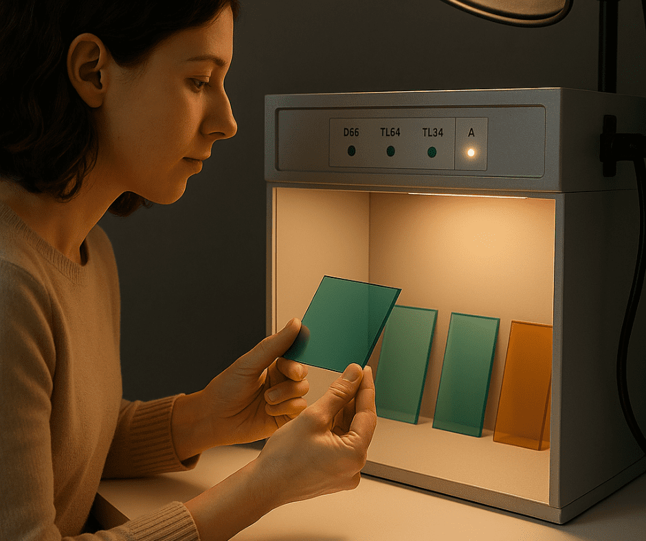
✅ Multi-Light Evaluations
We view and match all colors under various standardized light sources—like daylight (D65), warm incandescent, and fluorescent—using professional lightboxes. This helps us predict how your color will behave in the wild.
✅ Precise Batch-to-Batch Control
We retain physical sample panels from each approved production color. This gives us a real-world benchmark for future runs, ensuring your glass stays consistent—even across different orders or product launches.
✅ Collaborative Sampling Process
When you request a custom color, we don’t just send one panel—we often send options with slightly different undertones and finishes. You’ll get to see how they perform under different lighting before making a final call.
✅ Expert Guidance on Finishes
Some finishes—like matte paints or metallic overlays—can amplify metamerism. We help you balance aesthetics and functionality by recommending finishes that minimize color shift while enhancing your intended design direction.
Real Talk: Metamerism Is Manageable—with the Right Partner
As a product designer, you shouldn’t have to worry that your beautifully chosen “Desert Clay” or “Midnight Moss” will lose its magic under retail lights. By working with a glass decorator who understands the technical side of color science, you can keep your visual storytelling on point—across every platform, every light source, every time.
Thinking about launching a new color for your next vessel line?
Let’s collaborate on a solution that’s as beautiful as it is consistent.
📩 Download our design catalog or book a color consultation with a JAFE Decorating specialist today.