For more than a decade, blue has carried a lot of weight in branding.
It has signaled trust. Stability. Calm. Cleanliness. Professionalism.
In home fragrance, beauty, beverage, and even luxury packaging, blue became a safe and reliable choice. It reassured consumers in uncertain times and helped brands communicate credibility quickly.
But in 2026, we are starting to see something shift.
The question is no longer “What does blue mean?”
The better question is, “Does blue still feel relevant?”
Why Blue Dominated for So Long
Blue surged during a period when consumers were seeking reassurance.
After economic instability, health concerns, and digital overload, brands leaned heavily into:
- Soft dusty blues
- Deep navies
- Muted blue grays
- Clean aqua tones
It worked. Blue felt dependable. It felt calm. It felt safe.
But when a color becomes the default, it also becomes saturated.
And saturation changes impact.
The Risk of Overuse
When every brand signals trust the same way, trust tones lose distinctiveness.
In candle aisles, fragrance launches, and cosmetic packaging, blue has become so common that it often blends into the background rather than standing out.
This does not mean blue is “out.”
It means it is no longer automatically differentiated.
In some cases, heavy reliance on blue can unintentionally signal:
- Conservative positioning
- Lack of innovation
- Category sameness
That matters if your goal is to feel elevated, premium, or forward-thinking.
Cultural Shifts Are Influencing Color Direction
Color direction does not move randomly. It reflects emotional climate.
Right now, many consumers are experiencing:
- Institutional distrust
- Financial pressure
- Burnout from constant wellness messaging
- Social and political fatigue
For years, blue represented reassurance. Today, reassurance alone may not be enough.
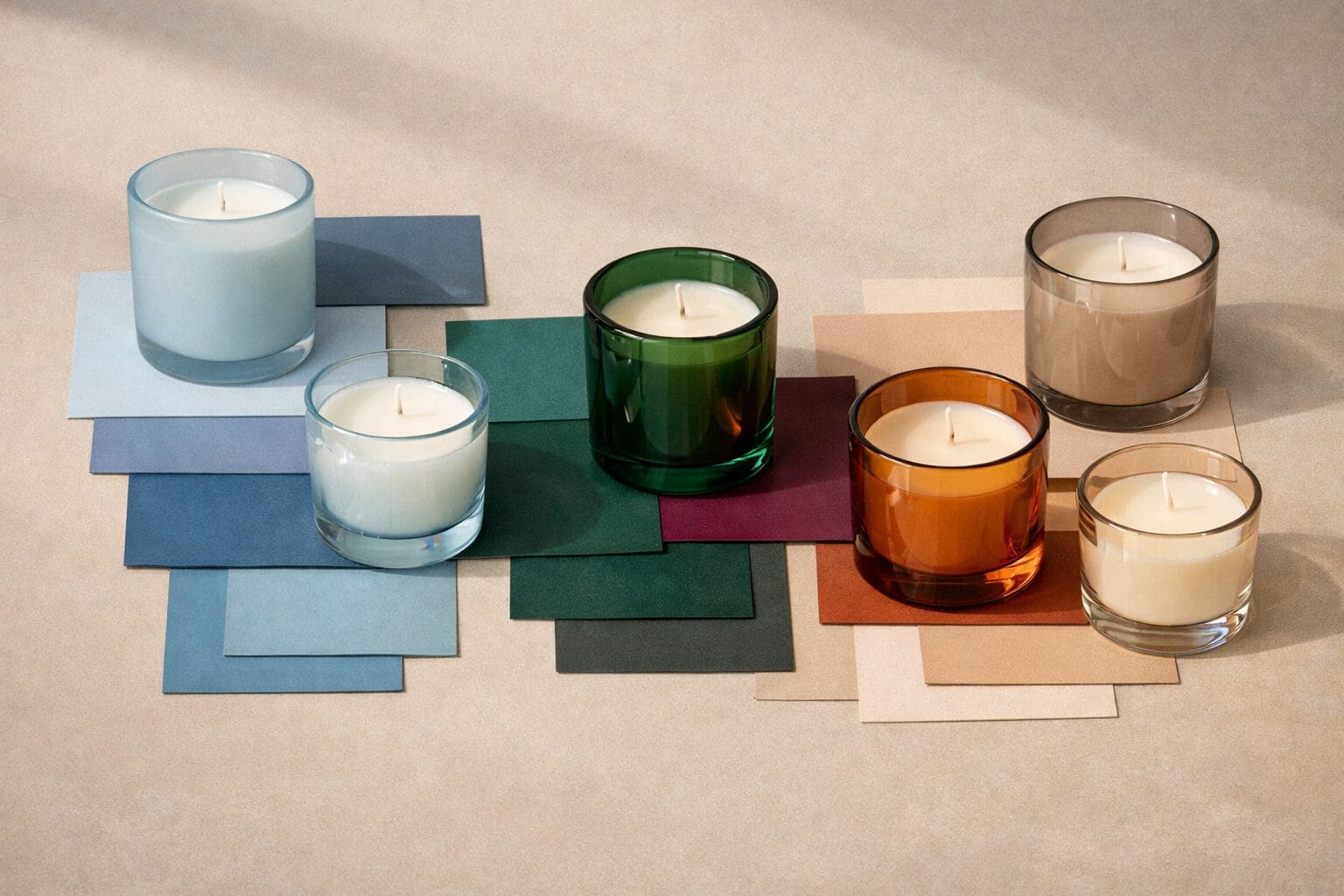
We are seeing brands explore tones that feel:
- More dimensional
- More aspirational
- More emotionally complex
Instead of calm, consumers are responding to elevation. Depth. Warmth. Substance.
That shift changes how blue functions in the marketplace.
When Blue Still Works
Blue is not disappearing.
It remains effective when:
- Your brand heritage is rooted in tradition and clarity
- You are communicating purity or freshness
- Your positioning is minimalist and refined
- You are pairing blue with unexpected texture or finish
A deep navy with a satin coating can still feel strong and modern. A layered blue with metallic screen print can feel elevated rather than standard.
The key is intention.
When It May Be Time to Reevaluate
If your brand leans heavily into soft blue because it “feels safe,” it may be worth reassessing.
Ask:
- Does this color still differentiate us on shelf?
- Does it align with our price positioning?
- Does it support an elevated or premium story?
- Are we using blue strategically, or simply by habit?
If your goal is to communicate upward movement or sophistication, you may consider exploring:
- Layered warm neutrals
- Deep jewel tones
- Complex charcoals
- Muted but rich earth tones
These directions are appearing more frequently in premium home fragrance and personal care launches.
Color Is Not Just Hue. It Is Finish and Depth.
Another factor that changes impact is finish.
A flat pastel blue communicates something very different than:
- A frosted cobalt
- A satin navy
- A smoky translucent indigo
- A metallic-accented deep blue
Often, the conversation is not about abandoning a hue, but about elevating its execution.
Specialty coatings, custom color matching, and surface treatment dramatically influence whether a color feels dated or directional.
What This Means for Product Development
If you are planning a launch this year, color selection should involve more than emotional symbolism.
Consider:
- Emotional climate
- Category saturation
- Shelf differentiation
- Finish and texture
- Price positioning
Trust still matters. But trust today may be communicated through craftsmanship, depth, and restraint rather than default blue palettes.
The brands gaining attention are not always the loudest. They are the most intentional.
The Bigger Takeaway
Blue is not losing its meaning.
It is losing its exclusivity.
And when a color becomes universal, strategy becomes more important than symbolism.
Before selecting your next palette, pause and ask not just what the color represents, but how it will compete visually and emotionally in today’s environment.
Color psychology still matters.
But cultural context matters just as much.
If you would like, we can also create a companion piece that explores which tones are gaining traction in response to this shift.