Color isn’t just visual—it’s emotional. It can communicate quality, spark nostalgia, create trust, or demand attention. When used intentionally, color becomes one of the most powerful tools in aligning packaging with brand identity. But finding the right palette is more than picking what looks good—it’s about telling the right story.
Here’s how to match your packaging colors to your brand’s identity while keeping consistency, differentiation, and meaning front and center.
Start with Your Core Brand Values
What feelings or ideas do you want your brand to evoke? Is it grounded in sustainability? Bold innovation? Relaxed luxury? The colors you choose should reflect the emotional tone your brand represents.
- Soft neutrals and earth tones communicate calm, minimalism, and natural elegance.
- Vivid primaries or high-saturation hues signal confidence, energy, or playfulness.
- Deep tones like navy, forest, or charcoal lean into premium, grounded, and mature aesthetics.
This first step filters your options through a lens of authenticity—what actually feels like you.
Use Color Psychology, But Don’t Be Cliché
Yes, blue is trustworthy and red is passionate—but oversimplifying leads to forgettable packaging. Instead, explore layered color combinations or unexpected finishes that add complexity to your message.
For example:
- Pairing cool greys with metallic copper can suggest a balance of modern tech and handmade artistry.
- A deep plum with soft matte texture speaks to refined luxury without defaulting to typical black-and-gold cues.
When color and finish work together, they don’t just speak—they resonate.
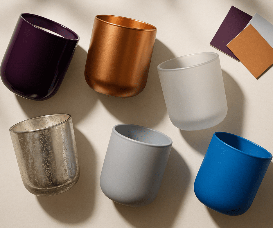
Choose Finishes That Reinforce the Message
The paint technique you select can elevate or undermine the mood you’re building with color. Think of the finish as the “texture” of your tone.
- Gloss finishes deliver a sleek, polished look that signals cleanliness, vibrancy, and shelf appeal—perfect for bold or modern brands.
- Frosted finishes introduce a soft, muted quality, creating a sense of subtlety and sophistication. These work especially well in wellness or minimalist aesthetics.
- Matte finishes offer a velvety, contemporary edge that feels grounded and high-end without being flashy.
Want to go beyond foundational finishes? Specialized coatings like:
- Silk or leather-effect finishes offer tactile elegance and depth
- Mercury and dichroic effects create dimensional shine and visual intrigue
- Granite-inspired coatings bring an earthy, handcrafted touch
When color and finish work in harmony, they help your packaging feel like your brand—before it’s even touched.
Test Colors in Real-World Lighting
A color that looks vibrant in your studio might shift under retail lighting—or in a customer’s home. This is where real-world testing comes in.
- View samples under multiple lighting conditions (daylight, LED, store shelf lighting).
- Test side-by-side with your existing brand assets or website palette.
- If possible, photograph samples in your target environment to preview cohesion and shelf impact.
When color consistency matters—and it always does—these extra steps make all the difference.
Keep Your Palette Tight and Memorable
Too many colors can dilute your brand message. Choose a primary and secondary palette that can work across all formats—labels, jars, secondary packaging—and stick with it.
Look for color combinations that:
- Have strong contrast for shelf visibility
- Are easy to reproduce at scale
- Remain distinct in a crowded market
Consistency doesn’t mean sameness—it means recognition. The more reliably your colors show up, the more your brand gets remembered.
Final Thoughts
Matching your packaging colors to your brand’s identity isn’t a surface-level decision—it’s a strategic one. The right palette paired with the right finish can elevate your product from functional to unforgettable.
Whether you’re refreshing your packaging or starting from scratch, lean into color as your silent brand ambassador. It’s not just what your packaging looks like. It’s what it says—without saying a word.
Want guidance on finishes and color matching?
Schedule a project consultation to explore options that align with your vision.