The design choices you make in 2026 will do more than define the look of your products. They will influence how consumers feel about your brand. From the colors you select to the finishes you apply, every decision is an opportunity to build trust, spark emotion, and set yourself apart in a crowded marketplace.
We’ve identified five major shifts that are shaping how brands approach decorative painting, screen printing, and other glass decoration techniques. These shifts are already influencing candles, fragrance, spirits, and decorated drinkware — and they’ll only grow stronger in the year ahead.
1. Sustainability Is the Standard
Eco-conscious design has moved from “nice-to-have” to “must-have.” Consumers expect proof of responsibility at every touchpoint, from the sourcing of materials to the packaging on the shelf.
For brands, this means aligning with decoration partners who minimize environmental impact by offering everything under one roof. At JAFE, for example, our candle fulfillment and decoration capabilities reduce freight and carbon footprint while giving you flexibility in finish and style.
Friendly Expert Tip: Palettes that echo nature — soft greens, grounded neutrals, and organic textures — visually reinforce sustainability without saying a word.
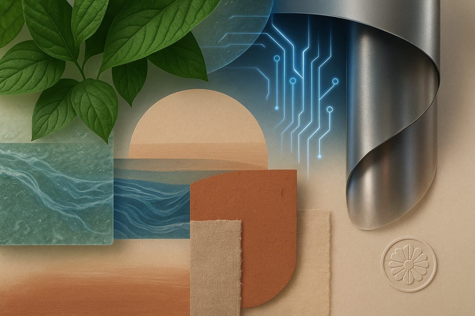
2. Technology Meets Human Warmth
AI, smart materials, and digital-first aesthetics are reshaping consumer expectations. But while people love innovation, they still crave warmth and authenticity.
This tension shows up in color and finish choices: pairing sleek metallics with tactile matte coatings, or blending high-tech iridescence with handcrafted textures. Screen printing techniques, when layered with subtle transparency, strike the balance between modern and human.
Friendly Expert Tip: If your brand leans innovative, think about how technology can look approachable and not cold.
3. The Search for Stability
Global uncertainty is pushing consumers toward products that feel safe, calming, and steady. Think soft blues, warm grays, and finishes that reassure rather than overstimulate.
For candle brands, this could mean using our quick ship program to access timeless vessels in grounding tones, decorated with finishes that project trust and consistency. For spirits or decorated drinkware, it’s about using neutral anchors that make collections feel classic yet fresh.
Friendly Expert Tip: Grounding colors don’t have to be dull. Pairing them with subtle ridges or frosted textures adds quiet sophistication.
4. Authenticity Takes Center Stage
Perfect polish is losing ground to honest imperfection. Consumers want to feel a human connection in the products they buy, which makes craft-inspired finishes and storytelling essential.
Decorative painting in ribbed, fluted, or matte finishes helps signal authenticity. Pairing these textures with warm palettes, like muted yellows, clay-inspired oranges, gives products an artisan feel that’s still scalable.
Friendly Expert Tip: Highlight the craftsmanship behind your products. A simple story about how a finish or texture was created can be just as compelling as the design itself.
Nostalgia With a Modern Twist
Nostalgic tones and heritage-driven finishes are making a comeback, offering comfort in uncertain times. But they’re not copy-paste vintage. Modern twists, like pairing deep, heritage browns with sleek satin finishes, make nostalgia relevant for today’s consumer.
In candle fulfillment, this might mean matte amber vessels paired with contemporary screen printing. In decorated drinkware, think fluted neutrals paired with a bold accent tone.
Friendly Expert Tip: Nostalgia works best when it’s balanced with progress. Pair heritage tones with a fresh accent to keep the story moving forward.
Where to Go From Here
Rather than short-term trends, these shifts highlight the direction consumers are moving. The question now is how your brand will adapt and respond.
That’s exactly what we explore in our 2026 Design Playbook — a comprehensive guide that includes:
- The full 2026 core palette with emotional signals and brand fits
- A pairing guide linking colors with materials and finishes
- Curated mini-palettes and strategy checklists for concept teams and brand designers
Download the Updated 2026 Design Playbook and see how you can translate these shifts into market-ready collections that stand out, resonate, and sell.