When it comes to custom-decorated glassware, color is everything.
Whether you’re a product designer curating a seasonal aesthetic, a private label rep managing large-scale rollouts, or an independent business owner launching a signature line—you expect your vessel colors to be consistent, beautiful, and true to your brand.
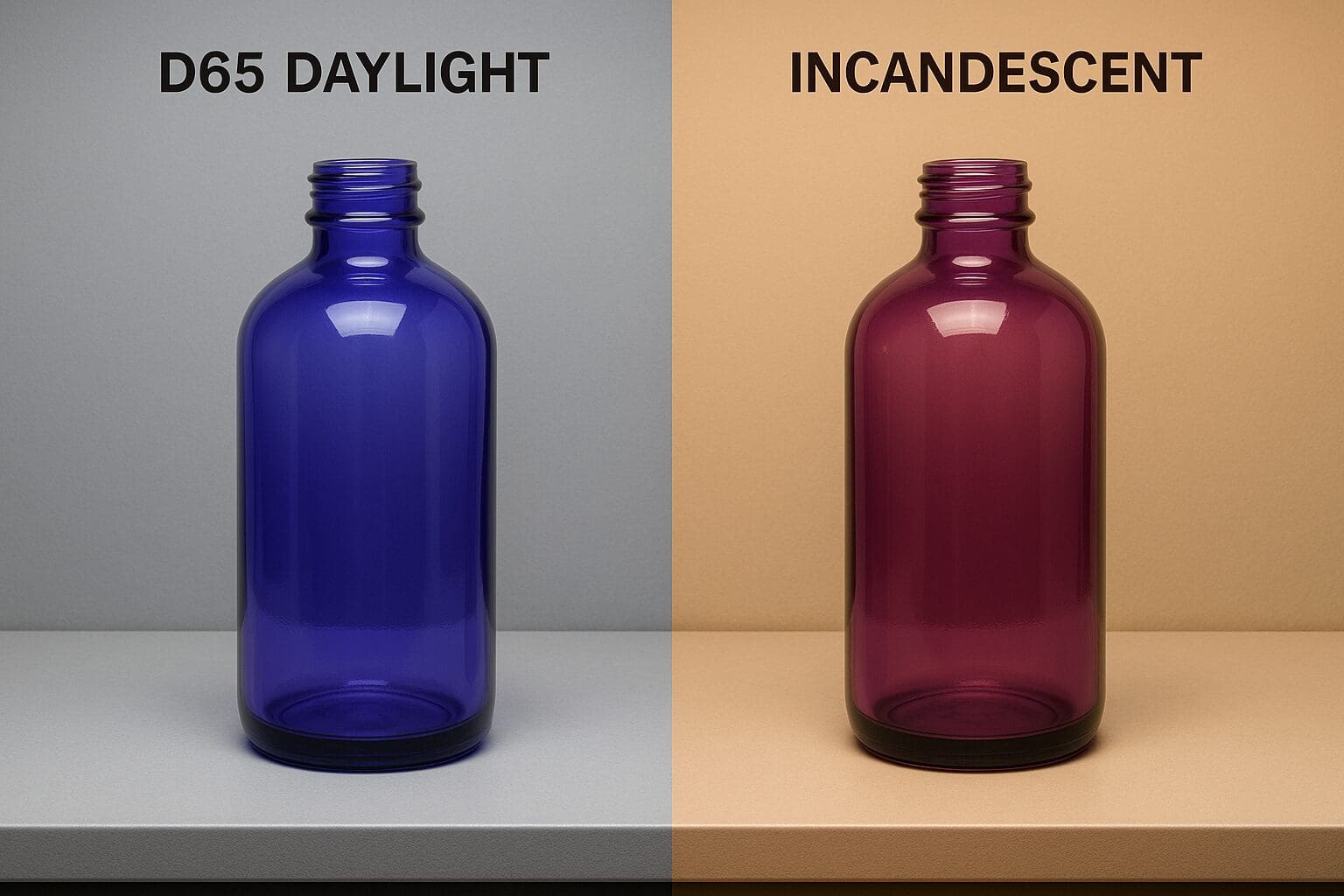
But there’s one factor that can quietly sabotage that consistency if it’s not handled properly: metamerism.
What Is Metamerism—and Why Should You Care?
Metamerism is a color phenomenon where two items appear to match under one light source but look completely different under another.
For example, that soft blush tone you approved in natural daylight might shift into a peachy beige under warm indoor lighting. Or a sleek matte black may suddenly look navy under store fluorescents.
These unexpected shifts can result in mismatched product lines, disappointed customers, or branding that feels just a little… off. And for growing brands, visual inconsistency is something you just can’t afford.
How We Control for Metamerism at JAFE Decorating
Metamerism may sound like a complicated problem—but for us, it’s just part of doing things right. Here’s how our team ensures your custom glassware looks consistent and color-true from start to finish, no matter the lighting:
1. Multiple Lighting Evaluations
Every color we develop is evaluated under several standardized lighting conditions—including:
- Daylight (D65)
- Incandescent (warm indoor light)
- Fluorescent (retail/store lighting)
This helps us predict how your color will behave in different real-world environments—and prevent any surprises before production even begins.
2. Side-by-Side Sample Comparison
We use professional-grade lightboxes and visual color standards to compare samples under the same lighting conditions. If your project includes multiple SKUs or repeat orders, we’ll make sure everything aligns—even if your products are produced months apart.
3. Physical Retains for Color Matching
We save a physical panel for every approved custom color. These become our trusted benchmarks when it’s time to reorder, expand your line, or match existing packaging. So you’ll always get the same color—even across different batches.
4. Rigorous Batch Testing During Production
Our Quality Control team monitors your product throughout the decoration process—not just at the start. From paint mixing to final inspection, we’re checking for color accuracy, finish quality, and consistency every step of the way.
5. Transparent Collaboration with You
We don’t just make color decisions for you—we bring you into the process. Whether it’s sending you finish variations, helping you visualize how a color behaves under store lighting, or guiding you toward the most stable hues for your design, we’re here as your creative partner.
Because It’s Not Just Color—It’s Brand Identity
For us, preventing metamerism isn’t about perfectionism—it’s about preserving your product’s integrity. Your customers should experience your brand the way you intended, whether they’re unboxing a candle at home or browsing your display in-store.
With our proactive approach, your colors stay consistent. Your story stays intact. And your products always look as stunning in real life as they did on your design board.
📦 Ready to create custom glassware that performs beautifully under any light?
Download our catalog or schedule a consultation with our team. We’d love to help you bring your vision to life—flawlessly