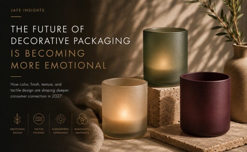
The Future of Decorative Packaging Is Becoming More Emotional
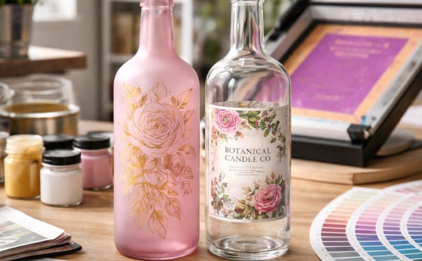
Decorative packaging is entering a softer, more emotionally intentional era. Across candles, home fragrance, beauty, wellness, hospitality, and lifestyle products, brands are moving away from loud visual excess and toward packaging that feels calmer, warmer, and more tactile. Consumers are increasingly drawn to products that create a sense of: That shift is influencing everything from […]
Read The Future of Decorative Packaging Is Becoming More Emotional