2027 Color & Material Direction Report
A practical look at the color, finish, and surface directions shaping glass packaging, candle vessels, home fragrance, beauty, drinkware, and hospitality collections. Packaging direction is shifting toward softer color, tactile finishes, layered translucency, and materials that feel calm, warm, and intentional. For brands working with decorated glass, those choices affect more than appearance. They shape how a product feels in a customer’s home, on a shelf, or in a hospitality space. This page highlights key themes from JAFE’s 2027 Color & Material Direction Report. For the full color palette, finish direction, and category recommendations, download the complete PDF.
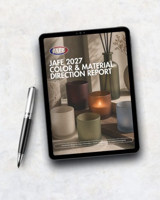
Color is only part of the story.
The strongest packaging collections for 2027 will not rely on color alone. Finish, texture, opacity, gloss level, translucency, and light interaction all influence how a product is perceived.
Across candles, home fragrance, beauty, wellness, spirits, drinkware, and hospitality, brands are moving toward products that feel more grounded, calming, and emotionally intentional. For decorated glass, this creates an opportunity to use surface, finish, and color together to create a stronger product experience.
What you’ll find in the report
The full report includes JAFE’s view of the color, material, and finish directions gaining commercial relevance for 2027.
Inside, you’ll find:
- The key 2027 design theme and market shift
- Six JAFE color directions for decorated glass and candle vessels
- Recommended finish pairings
- Guidance for matte, frosted, satin, translucent, metallic, and textured effects
- Category direction for candles, home fragrance, beauty, drinkware, spirits, and hospitality
- What’s fading in color and finish direction
- Practical takeaways for planning decorated glass projects
Key 2027 Direction: Softer Color, More Intentional Surfaces
For 2027, packaging direction is moving away from harsh contrast, high gloss, sterile cool grays, loud neon palettes, and overly busy decoration.
Brands are leaning into warmer neutrals, muted greens, atmospheric blues, deeper wine tones, soft matte finishes, frosted effects, layered translucency, and restrained metallics.
For decorated glass, this shift matters because color, opacity, texture, and reflectivity all change how a product feels in the customer’s space. A matte finish can make a neutral feel warmer and more tactile. Frost can soften light and create depth. Translucency can help a candle vessel feel more atmospheric when lit.
Who should use this report
This report is built for teams planning new or refreshed glass packaging, candle vessels, fragrance collections, and lifestyle products.
It can be useful for:
- candle and home fragrance brands planning new collections
- beauty and personal care brands refreshing glass packaging
- packaging designers exploring finish and material direction
- product developers choosing colors, coatings, or decoration methods
- hospitality and private label teams building elevated product lines
- marketing teams preparing seasonal or trend-led launches
How JAFE can help bring the direction to life
JAFE helps brands move from color and finish inspiration to production-ready decorated glass and filled candle products.
Our team can support custom coatings, color matching, screen printing, frosting, matte and gloss effects, sampling, candle filling, wicking, fragrance development, quality control, and packing customer-provided components.
Every new project requires review and sampling before production so the final appearance, decoration method, and manufacturability can be evaluated clearly.
Want the full 2027 color and finish direction?
Want the full 2027 color and finish direction?
Download the complete report to see JAFE’s core 2027 color collection, finish recommendations, category guidance, and product planning takeaways.
Tell us where to send the report. If you’re working on a glass decoration or candle project, you can also share a few details so our team can follow up with more relevant guidance.