Every customer wants their design prints to be clean and attractive when applied to glass. Our screen print department takes great pride in helping customers achieve their product vision daily. We would like to offer three tips to achieve the highest quality prints possible. Please note that these design recommendations are advising tools, rather than restrictions or hard-and-fast rules.
Screen Print Tip #1: Be Big, Be Bold.
JAFE can print hand-written, elegant and artistic strokes. However, certain strokes can be too fine to print properly. A simple guide for line-weight is that anything thinner than the approximate natural stroke of an ink pen or pencil may cause concern for the screen-making process. Simply put, artwork that is too thin and too fine will not image well to a screen and may drop out entirely. For best results, steer away from super-fine lines and extensive detail.

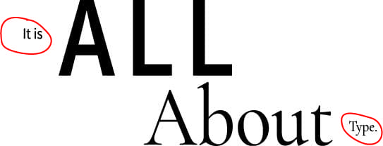
Screen Print Tip #2: It’s All About Type.
More often than not, a design is made or broken based on its typeface. Be aware that some fonts are better for quality screen prints than others. Bold, block fonts, for example, have a higher chance of a clean print than serif and hand-written fonts. For best results, steer clear of fonts with super fine lines and be mindful of serif fonts with very thin feet, legs, ears, etc., and other fonts with letters that are prone to fill-in its counter or aperture ( such as “A”, “B” “P”, and more.) The size of your fonts is another consideration. Naturally, the smaller the fonts in your design-the less likely they are to print cleanly and legibly.
Screen Print Tip #3. Simple is Better.
Vessel artwork is creative and can vary in style! However, designs with extensive detail or significant ink coverage may prove challenging to the screen-printing process. For best results, keep graphics simple and allow for elements to breathe. This design choice will make your designs more organized and easy to digest for your consumers when the finished product sits on store shelves.
Our Screen Print Department works with customers to achieve the best possible results. We are always up for a challenge, but these three tips can help create clean, attractive images. Contact us today to get started!
Thank you for choosing us as your decorator of choice!